
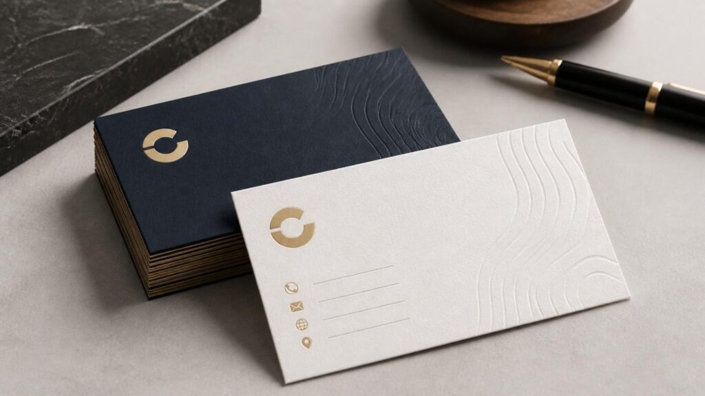
A business card may be small, but it plays an important role in professional networking and brand recognition. When someone takes your card at a meeting, trade show, sales appointment, or networking event, the paper quality, design, and finish can influence how they remember your business. That is why choosing the right materials is just as important as creating an attractive layout.
Successful business card printing involves more than putting a logo and contact information onto paper. You need to consider the card stock, thickness, surface finish, colors, typography, spacing, and practical details such as readability and durability. The right combination creates a card that looks professional and feels appropriate for your brand.
Whether you are creating cards for a new company, refreshing an existing identity, or ordering Custom business cards for employees, understanding the basics can help you make better printing decisions.
Why Business Card Paper Stock Matters
The paper stock is the foundation of a business card. It affects how the card feels in the hand, how colors appear, how durable it is, and how well different finishing options perform.
A heavier stock generally creates a more substantial feel, while lighter stock can be useful for large-volume applications where practicality and budget are important. Common business card options include standard cardstock, premium cardstock, coated stock, uncoated stock, recycled paper, and specialty materials.
For many professional applications, 14 pt and 16 pt cardstock provide a practical balance between durability, appearance, and print quality. However, the ideal choice depends on how the card will be used and what impression your brand wants to communicate.
What Is Business Card Paper Stock?
Business card paper stock refers to the material used to produce the card. Unlike ordinary office paper, cardstock is thicker and more rigid, making it suitable for pieces that need to withstand frequent handling.
Stock can differ in:
- Thickness
- Weight
- Texture
- Surface coating
- Color
- Printability
- Durability
These differences can noticeably change the finished product. A minimalist design on an uncoated textured stock can feel completely different from the same design printed on a smooth, glossy card.
Common Business Card Paper Stock Options
Choosing the right business card paper stock starts with understanding what each option offers.
1. Standard Cardstock
Standard cardstock is a practical choice for everyday business cards. It provides enough thickness to feel professional without requiring specialized materials.
It works well for:
- Small businesses
- Sales professionals
- Consultants
- Service providers
- Networking events
- General corporate use
A standard stock can also be paired with matte, gloss, or satin finishes depending on the desired appearance.
2. Premium Cardstock
Premium cardstock offers a thicker and more substantial feel. It can be useful for brands that want their cards to communicate a higher-end or more established image.
Design agencies, real estate professionals, financial services, consultants, and luxury businesses may benefit from premium stock when the physical experience of the card is an important part of the brand presentation.
3. Uncoated Stock
Uncoated paper has no glossy or protective coating on the surface. It generally provides a more natural, tactile feel and can be easier to write on than heavily coated materials.
This can be especially useful for appointment cards, service businesses, personal notes, or cards where someone may need to write additional information.
Uncoated paper also works well for brands that want a natural, understated, handcrafted, or traditional appearance.
4. Recycled Stock
Recycled cardstock can support a brand identity centered around environmental responsibility. It is available in different textures, colors, and weights, depending on the printing provider.
However, sustainability should be considered alongside print quality and durability. Always evaluate how the selected stock handles your colors, images, and finishing requirements before committing to a large order.
5. Textured and Specialty Stock
Textured papers can introduce another sensory element to a business card. Linen, cotton, kraft, and other specialty stocks can give the card a distinctive appearance and tactile quality.
These materials may be particularly suitable for:
- Creative professionals
- Artisan businesses
- Boutiques
- Photographers
- Architects
- Designers
- Craft-focused brands
The key is to make sure the texture supports the design rather than competing with it.
Understanding Business Card Finishes
After selecting your stock, the next major decision is the finish. Business card finishes can change the card’s appearance, texture, durability, and even how colors are perceived.
The most common options include matte, gloss, satin, soft touch, spot UV, foil, embossing, and debossing.
Matte Finish
Matte is a smooth, non-reflective finish that creates a clean and professional appearance. It is a popular choice for minimalist designs, corporate cards, and layouts containing substantial amounts of text.
Because it produces less glare than gloss, information can be easier to view under bright lighting.
Matte is particularly effective when you want the design to feel refined rather than highly reflective.
Gloss Finish
Gloss provides a shiny surface that can make colors appear more vibrant and images more prominent. It can work especially well for photography, colorful branding, restaurants, entertainment businesses, and visually driven designs.
The trade-off is that glossy surfaces can produce more glare and may not be as convenient when recipients need to write on the card.
Satin or Silk Finish
Satin and silk finishes offer a middle ground between matte and gloss. They provide some surface sheen without the highly reflective appearance of a full gloss finish.
This makes them a versatile option when you want good color presentation while maintaining a relatively subtle appearance.
Soft-Touch Finish
Soft-touch finishing adds a smooth, velvety texture to the card. It is often selected for premium or luxury-oriented designs because the tactile experience makes the card feel different from standard printed materials.
Soft-touch finishes can pair particularly well with:
- Minimalist layouts
- Dark backgrounds
- Premium branding
- Elegant typography
- Foil details
However, specialty finishes should be selected based on how the card will be handled and stored, not simply because they look impressive in a sample.
Spot UV
Spot UV applies a glossy coating only to selected parts of the design rather than covering the entire card.
For example, you might use Spot UV on:
- A logo
- Company name
- Icon
- Pattern
- Important graphic element
Combining Spot UV with a matte background creates contrast between glossy and non-glossy areas. This technique can make a simple design more visually engaging without covering the entire card in a shiny finish.
Foil Stamping
Foil stamping adds a metallic or specialty-colored effect to selected design elements. Gold and silver are common choices, although other foil colors may be available.
Foil can work well for luxury brands, jewelry businesses, premium services, hotels, designers, and other businesses where a sophisticated visual identity is important.
The best results usually come from using foil selectively rather than covering too many elements.
Embossing and Debossing
Embossing raises a design element above the surface, while debossing presses it into the material.
These techniques add physical depth and can create a memorable tactile experience. They are particularly effective when used with logos, initials, or simple graphic elements.
Because these processes add complexity, discuss the artwork and material requirements with your printer before finalizing the design.
How to Choose the Right Stock and Finish
There is no single business card material that works for every company. Your decision should be based on your brand, audience, design, usage, and printing requirements.
| Business Need | Suggested Stock | Possible Finish |
| Everyday professional cards | 14 pt or 16 pt cardstock | Matte or satin |
| Premium brand identity | Heavier cardstock | Soft touch or foil |
| Photography-heavy design | Smooth coated stock | Gloss |
| Minimalist corporate card | Premium cardstock | Matte |
| Cards that require writing | Uncoated cardstock | Uncoated or light matte |
| Artisan or natural brand | Kraft, cotton, or textured stock | Uncoated |
| Luxury presentation | Thick or specialty stock | Foil, embossing, or soft touch |
These are starting points rather than strict rules. A physical paper sample is often the best way to evaluate how a stock actually feels and how your chosen colors reproduce on it.
Essential Business Card Design Tips
The best materials cannot fix a confusing design. Before sending your artwork for business card printing, make sure the layout communicates the most important information quickly.
Keep the Design Simple
A business card has limited space. Trying to include every service, social profile, slogan, and contact method can make the design difficult to scan.
Prioritize the information your recipient is most likely to need:
- Business name
- Logo
- Person’s name
- Job title
- Phone number
- Email address
- Website
- Relevant social media or location information
Remove anything that does not contribute to the card’s primary purpose.
Establish a Clear Visual Hierarchy
Not every element should have equal visual importance.
Your business name and logo should be easy to identify, while contact details should remain readable without competing with the primary branding.
Use differences in font size, weight, spacing, and placement to establish hierarchy.
Choose Fonts Carefully
Typography should reflect your brand while remaining easy to read.
Avoid using too many typefaces on one card. Two complementary fonts are often enough to establish hierarchy while keeping the design cohesive.
Pay particular attention to small text. Decorative fonts that look attractive at a large size may become difficult to read when reduced.
Use Brand Colors Consistently
Your business card should feel connected to your website, packaging, signage, social media, and other marketing materials.
Use your established brand colors where appropriate, but make sure there is enough contrast between text and background.
Remember that colors can appear differently on screen and in print. The paper and finish can also influence the final appearance, so reviewing a physical proof or sample can be useful.
Make Your Contact Information Easy to Find
A beautiful card is not effective if someone cannot quickly locate your phone number or email address.
Use spacing and alignment to separate contact information from decorative elements. Make sure important details are large enough to read comfortably.
If you include a QR code, leave sufficient clear space around it and test the printed version before approving a large run.
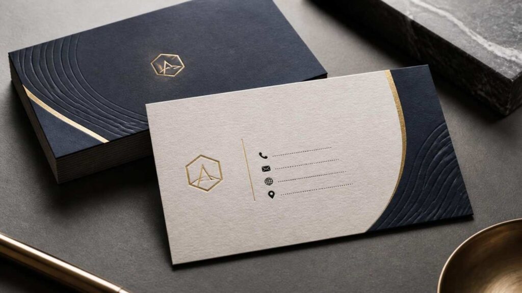
Don’t Overlook the Back of the Card
The back of a business card provides valuable design space, but it does not have to be filled.
You could use it for:
- A logo
- Brand statement
- QR code
- Short service list
- Social media information
- Appointment details
- A simple visual pattern
Alternatively, leaving the back relatively open can create a clean, premium appearance and may give recipients room to write notes.
Prepare Your Artwork for Printing
Good design also depends on correct file preparation.
Before sending artwork to a printer, check the required specifications for:
- Final trim size
- Bleed
- Safe margins
- Color mode
- Image resolution
- Fonts
- File format
- Finishing layers
Many professional printers request print-ready PDF files and may have specific requirements for bleed, color profiles, and specialty finishing. Always follow the printer’s current artwork specifications rather than relying on generic settings.
Images should have sufficient resolution for the final print size, while small text and thin lines should be reviewed carefully because different stocks can reproduce fine details differently.
Common Business Card Printing Mistakes to Avoid
Even a strong concept can produce disappointing results if the production details are overlooked.
Choosing Stock Only by Price
The cheapest paper may not deliver the appearance or durability your brand requires. Consider the purpose of the card and how recipients will interact with it before choosing based solely on price.
Using Too Many Finishes
Combining foil, Spot UV, embossing, unusual shapes, and multiple colors can quickly make a small card look overcrowded.
Choose finishing techniques that support the design rather than distract from it.
Making Text Too Small
Business cards are compact, but that does not mean every detail should be reduced to the smallest possible size. Readability should remain a priority.
Ignoring the Paper Texture
A highly textured stock can change how fine lines, small text, and detailed graphics reproduce. If your design depends on precision, choose a surface that supports it.
Skipping a Physical Sample
A design can look perfect on a monitor and still feel different when printed. A physical sample lets you evaluate color, thickness, texture, readability, and finish before committing to a full production run. This is particularly useful when choosing specialty materials or finishes.
How to Create Custom Business Cards That Represent Your Brand
The strongest Custom business cards combine practical information with a consistent visual identity. Start by defining the impression you want the card to create. A professional services firm may want a restrained matte card, while a creative studio might benefit from an unusual stock or tactile finish.
At AttaPack, thoughtful material selection and professional printing can help businesses turn a simple card into a consistent part of their overall brand presentation.
Think about the complete experience rather than one individual feature. The paper should support the design, the finish should complement the stock, and the layout should make important information easy to understand.
Final Thoughts
Business card printing is a combination of design, material selection, and production quality. The right business card paper stock gives your card an appropriate foundation, while the right business card finishes add visual and tactile character.
Start with your brand and intended use. Then choose the stock, finish, colors, typography, and layout that support those goals. Keep the information focused, make contact details readable, prepare your artwork correctly, and whenever possible, review a physical sample before approving a large print run.
When these details work together, a business card becomes more than a piece of contact information. It becomes a compact, practical representation of your brand that people can hold, keep, and remember.
Frequently Asked Questions
What is the best paper stock for business cards?
There is no universal best stock. For many professional applications, 14 pt or 16 pt cardstock offers a practical balance of durability and presentation. Uncoated stock can be useful when the card needs to be writable, while specialty stocks can provide a distinctive tactile experience.
Is matte or glossy better for business cards?
It depends on the design and intended use. Matte provides a more subdued, professional appearance and reduces glare, while gloss can make colors and images appear more vibrant. Consider whether readability, photography, or tactile appearance is the main priority.
What is the most professional business card finish?
Professional appearance depends on the brand rather than one specific finish. Matte, satin, soft touch, and carefully applied specialty finishes can all look professional when they complement the design and audience.
Can you write on matte business cards?
Some matte and uncoated cards are suitable for writing, but the actual result depends on the specific coating and paper. If writing space is important, ask your printer which stock is designed for handwriting.
Are thicker business cards better?
Thicker cards can feel more substantial and durable, but thickness is not automatically better. The appropriate stock depends on your brand, design, intended use, storage, and printing requirements.